KathaDoi
Identity | Branding Assets
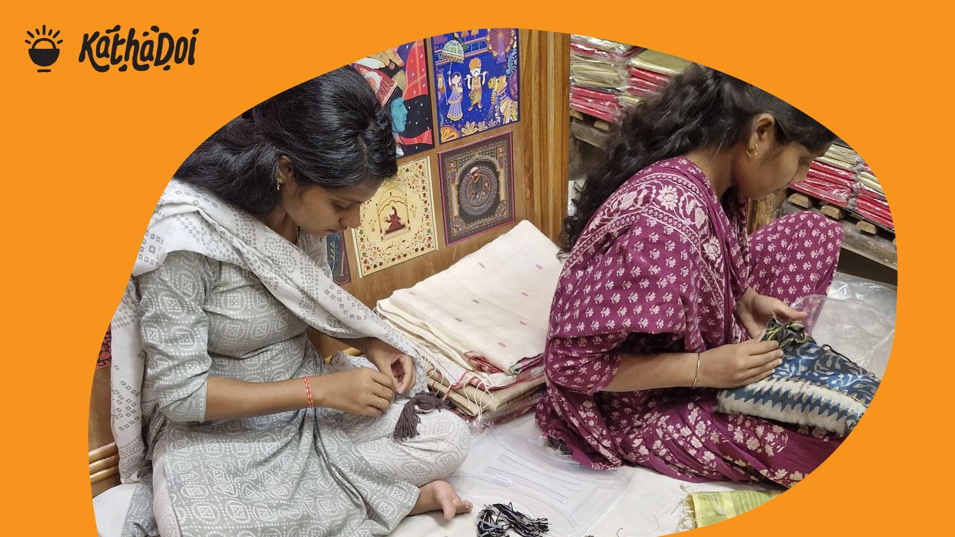
KathaDoi wants to tell sweet stories about Indian crafts and the heritage they have carried for generations for the contemporary Indians as well as people anywhere in the world who value handmade crafts.
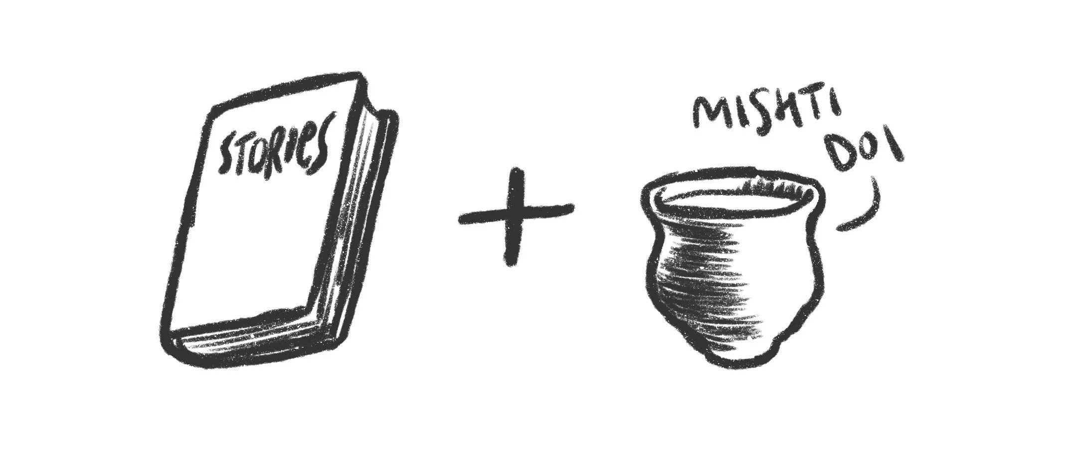
The name is a play of the Hindi word for story and the Bengali word for sweetened yogurt meaning sweet stories.
The symbol
The symbol is inspired by the combination of words in the name of the brand. The bowl-like shape at the bottom is inspired by the clay pot of the mishti doi (sweetened yogurt) one can find in Kolkata and the rising sun is symbolic of joy, freshness and hope that good stories bring to our lives.
The lettering that can be seen above invokes imperfections of a hand made object yet creating a harmonious composition with a few dabs of yogurt around it.

The brand language
The brand exudes an confident yet organic feeling. It is embodied by its identity and extended throughout its communication through colours and compositions that are minimal yet fluid.